


I was building this Social Networking App (Traveller's Stash) for learning MERN stack a few months ago. The way I planned the html layout back then, I needed to use 100vh for the layout to work and scroll correctly across all devices.
The root of the main content was set to 100vh. The layout worked as intended in Firefox DevTools across all device sizes, but when launched on an actual device, the bottom navbar was out of viewport and only appeared when the page was scrolled or dragged up a little bit.
In DevTools (every part of the layout was in the right place):
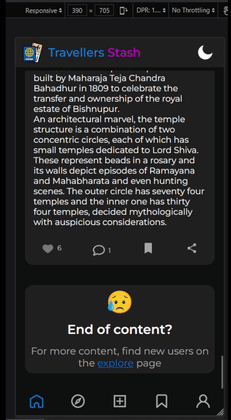
In Android Browser (the navbar can only be seen when dragged up):
I was confused since it worked properly in DevTools but not in the Android browser. I first assumed it was a browser issue, so I tested the page in various browsers. It obviously didn't work, so I tried to make the layout work in a different approach, which likewise didn't provide the desired outcomes. However, after reviewing other stackoverflow answers, I discovered that the value of 100vh on Android browsers is more than simply just the viewport. As a result, the navbar was disappearing from view.
So why is 100vh in mobile browsers more than the viewport?
Most common mobile browsers has an address bar at the top.
Some browsers like Safari, Edge Mobile etc also includes a bottom bar.
When a height in vh units is calculated, the height of every element (top bar + viewport + bottom bar) is included in it.
So when you apply this height to an HTML element, it normally overflows the visible viewport
Solution ?
There are a few CSS solutions that, for some reason or other, never worked for my layout that you can easily find with a simple Google search. What I'm going to show you is a JavaScript based solution that I used and that I believe is the best solution for React-based applications. It can also be used in vanilla JS.
After looking through a few stackoverflow solutions, I came across this custom react hook use100vh available as a npm package. Unwilling to add another package to my already large bundle, I decided to dig through the code and create this simple custom hook for the exact purpose I need.
import { useEffect, useState } from "react";

const use100vh = () => {
  const [height, setHeight] = useState(window.innerHeight);

  const setWindowHeight = () => {
    setHeight(window.innerHeight);
  };

  useEffect(() => {
    window.addEventListener("resize", setWindowHeight);
    return () => window.removeEventListener("resize", setWindowHeight);
  }, []);

  return isDocumentRendered() ? `${height.toString()}px` : null;
};

const isDocumentRendered = () => {
  return typeof window !== "undefined" && typeof document !== "undefined";
};
export default use100vh;
The code here declares a state variable with the initial value window.innerHeight, the object window.innerHeight stores the actual value of the viewport, excluding any top or bottom bar, and returns it to be used anywhere. This custom hook also includes an event listener attached to listen to any resize events so the height can be adjusted accordingly. The isDocumentRendered function simply checks if the document is rendered yet or not to prevent any errors.
This code can be tweaked and used in vanilla Javascript as well.
This is the first ever blog I have written. Thank you for reading!!